BEONTYME • PRODUCT 2022
Tyme - Meetings, made simple
OVERVIEW
Remote work made meetings easier to join, but harder to manage.


After COVID, remote and hybrid work made meetings easier to attend, but harder to keep track of. People were moving between Google Meet, Zoom, Skype, Outlook, and calendar tools just to get through a normal week.
The problem was not one bad app. It was the constant reset between interfaces, meeting links, calendars, and setup patterns. Tyme started from that friction: one place to plan, manage, and join meetings without rebuilding the same context every time.
Our research confirmed this:
SOLUTION
Bringing scattered meetings into one place
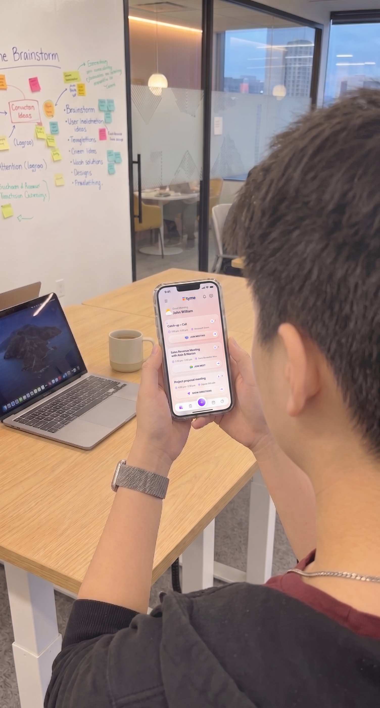
Tyme brought scattered meeting tasks into one place, so users did not have to jump between tools just to plan or join their day.
I proposed an “OOO” structure for the product: One Place, One Flow, One Overview.

One Place
Schedule all your meetings from Google, Outlook, Zoom, and more in a single place.

One Flow
Set up meetings across any platform in the same simple flow.

One Overview
Get a clear view of your day and time in meetings
This gave the product a simple structure: one place to manage meetings, one familiar setup flow, and one view for what was coming next. I used that structure to shape the core flows.
CORE FLOWS
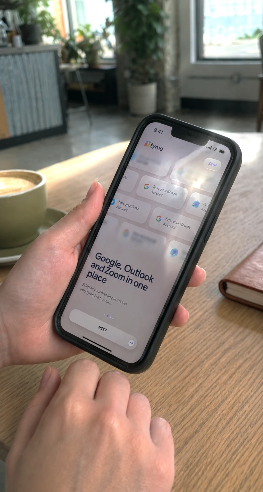
Onboarding
A short onboarding flow introduced the main actions without slowing users down.
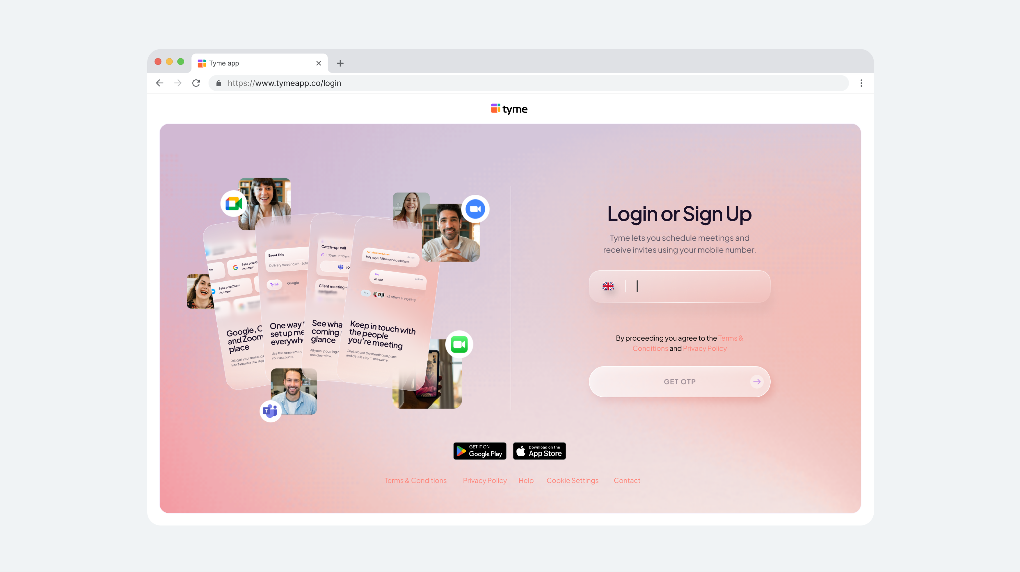
Login / Sign up
Get started with one-click login, or create an account in just a few seconds.
Sync Accounts
Users could connect accounts during onboarding and start with meetings already in place.
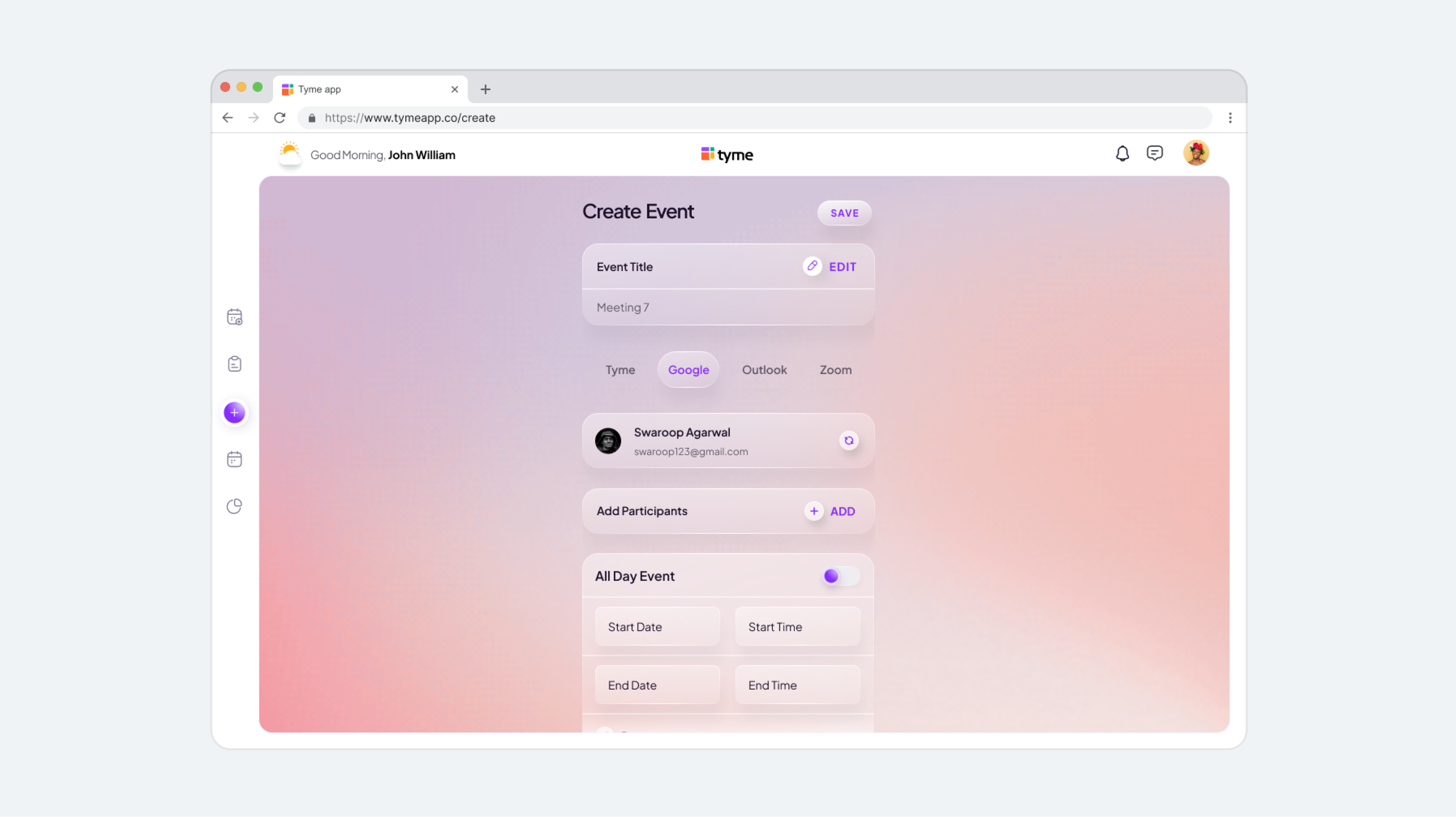
Creating an event
The same creation flow worked across Tyme, Meet, and Outlook tools.
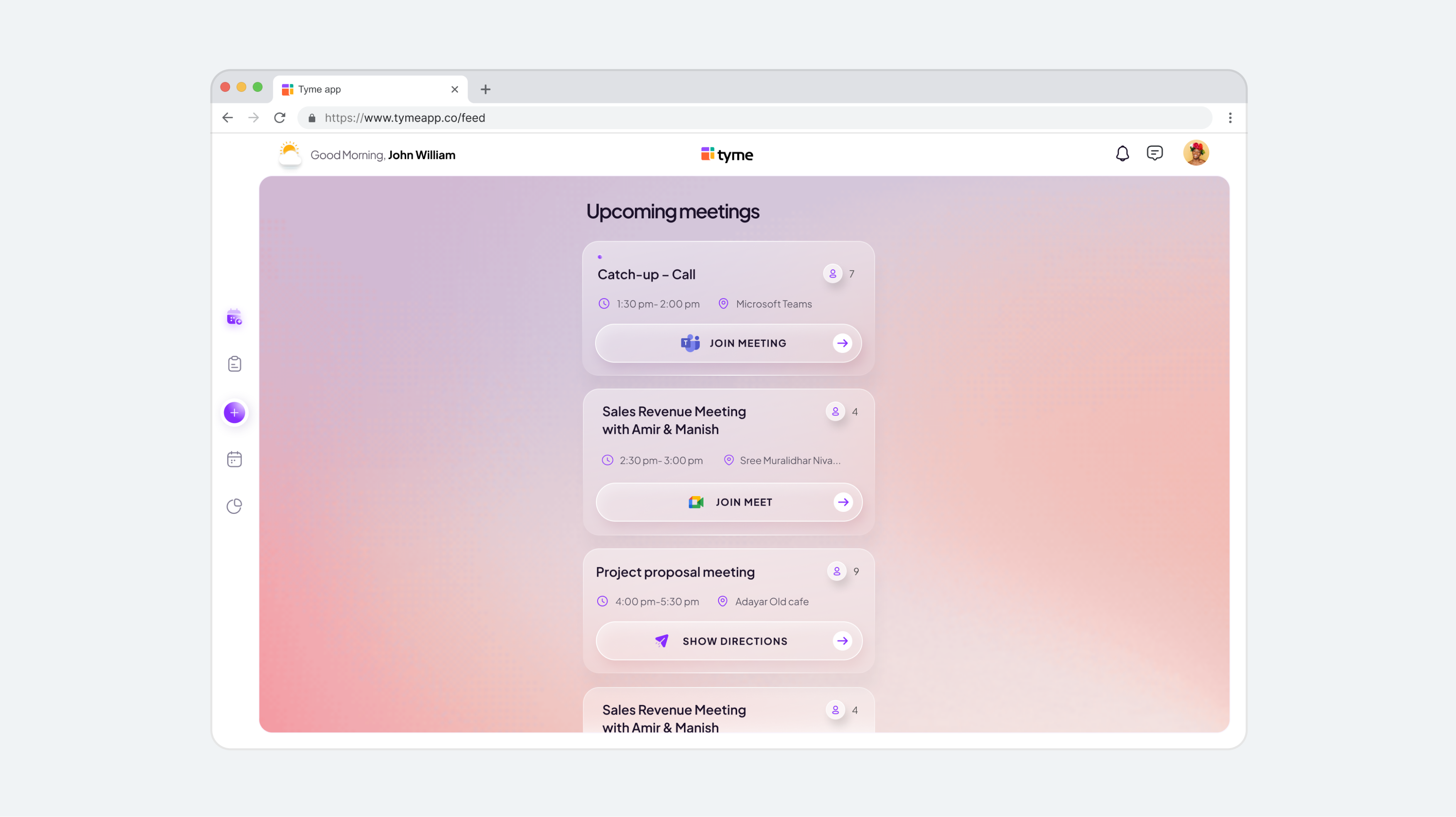
Calendar View
View all events at a glance or explore them one by one.
Chat threads
Keep event conversations in one place. Share updates and suggest new times instantly.
DESKTOP
The same product, scaled for desktop
Desktop was not treated as a separate product. The same flows expanded to a larger screen, so users could keep the mental model they already learned on mobile.
RESEARCH
Understanding where meetings broke down
We studied how people planned meetings across different tools, where they lost time, and what made remote coordination feel tiring.
The goal was to identify friction points in scheduling, event visibility, and daily coordination before defining the Tyme product direction.
KEY INSIGHTS
Research findings
To understand how users managed meetings across multiple tools, we surveyed 30 participants who regularly use platforms such as Google Calendar, Outlook, Zoom, and other scheduling apps.
Total surveyed users: 30
PROTOTYPING & TESTING
Testing the flow before adding detail
Testing showed where users slowed down, especially around setup, platform cues, and meeting actions. Each round helped us simplify the flow before adding more detail.


FEEDBACK
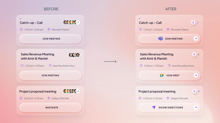
Users could not tell which app would open
Labels like “Join” were too vague. Users wanted to know whether they were opening Meet, Teams, or another meeting tool before they tapped.
The meeting cards felt visually crowded
Stacked avatars made the cards feel busier than they needed to be, especially when users were checking the next meeting quickly.
CHANGES
RESULT
Meeting actions became clearer
Adding platform icons and specific CTA labels made each action easier to read at a glance.
Simplified participant indicators
Replacing avatar stacks with participant counts made the card cleaner without removing useful meeting context.
CONSIDERATIONS
Smaller details that made Tyme feel calmer
I also worked on the smaller moments around meetings: notifications, time changes, and ambient details that made Tyme feel less static.
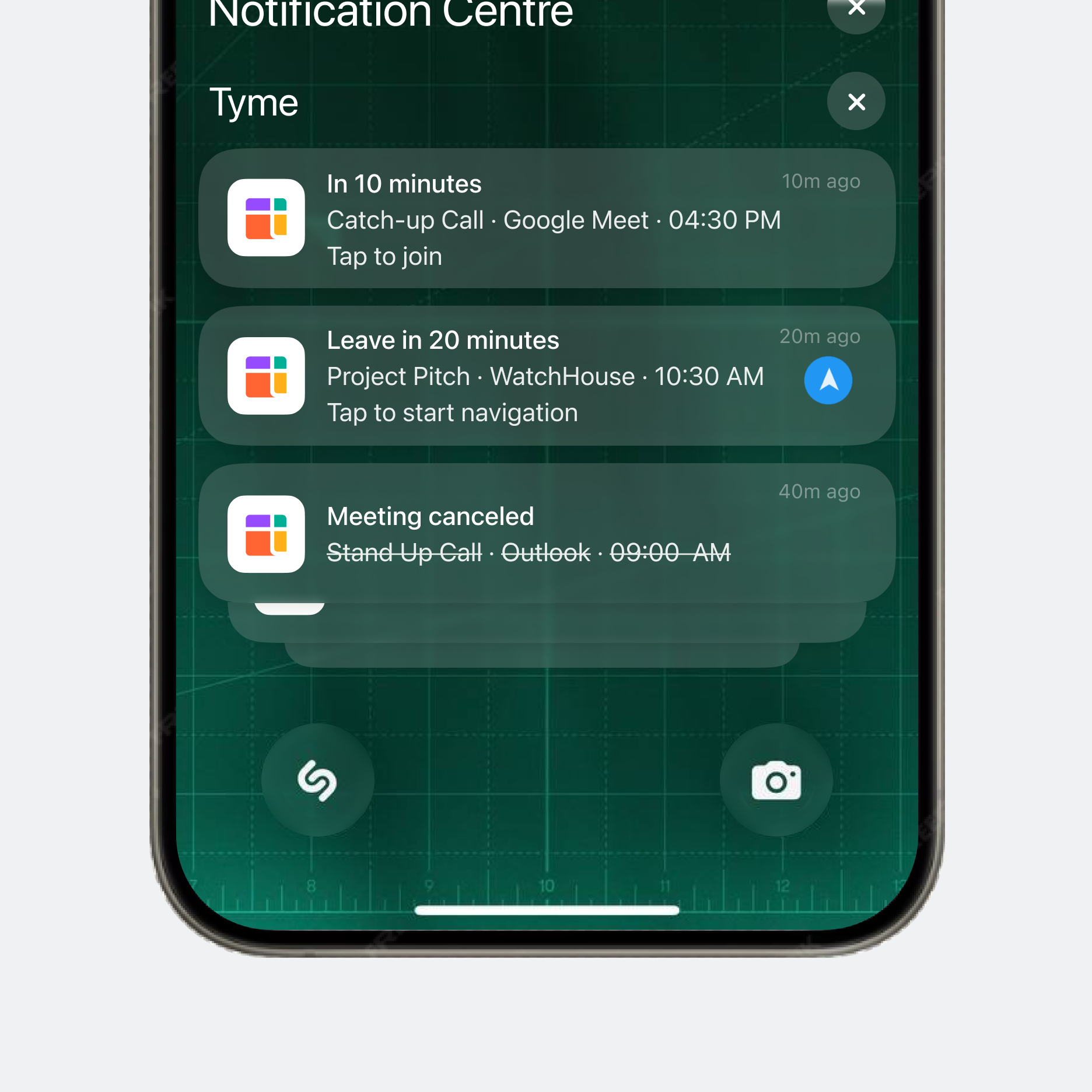
Smart Notification Types
Notifications changed based on urgency and timing, including upcoming meetings, cancellations, directions, and quick join prompts.
Time-of-Day Atmosphere
The background changed subtly with the time of day, so the interface felt closer to the user’s routine.
Dynamic Time Indicator
A small sun-to-moon transition showed the passage of time and gave the interface a warmer, more lived-in feel.
IMPACT
What changed after launch
We conducted a post-launch survey with users who had participated in earlier research and adopted the product after release.
Total surveyed users: 30
REFLECTION
What I took from the project
Simplifying meant choosing what not to show.
Tyme could have easily become another busy calendar app. The hardest part was deciding what to remove, delay, or hide so the next meeting stayed easy to understand.