
Vishnu Prasad
Product Head
NIPPON PAINT • B2B 2023
A UX redesign for a field-sales PWA used by Sales Officers to measure homes, prepare quotations, and move leads closer to conversion.
CASE IN BRIEF
NINJA is Nippon Paint’s internal field-sales PWA. This case study focuses on the home assessment flow, where Sales Officers spent the most time and faced the most friction.
Sales Officers were spending 40-50 minutes completing home assessments in a PWA that was hard to navigate, repetitive, and difficult for new users to learn. I redesigned the assessment flow, navigation structure, and measurement model to reduce field effort and make the product easier to scale across a growing sales team.
PRODUCT CONTEXT
NINJA supported multiple sales workflows, from lead assignment to home assessment and quotation. Assessment sat at a critical point in that journey. If a Sales Officer took too long to measure a home, quotation and conversion slowed down too.
Lead assigned Customer visit Home assessment Quotation Conversion
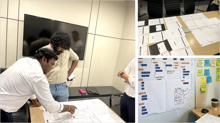
RESEARCH
We reviewed the existing app, spoke with product and business stakeholders, and interviewed Sales Officers with different experience levels.
Product Head

Business Analyst

Sales Officer - 6 years

Sales Officer - 3 months
KEY FINDINGS
Assessments took around 40-50 minutes.
Long screens made users lose context.
Repeated measurements slowed the visit.
CTAs and exit paths were unclear.
New users needed too much guidance.
UI layouts were not field-friendly enough.
UX PROBLEM
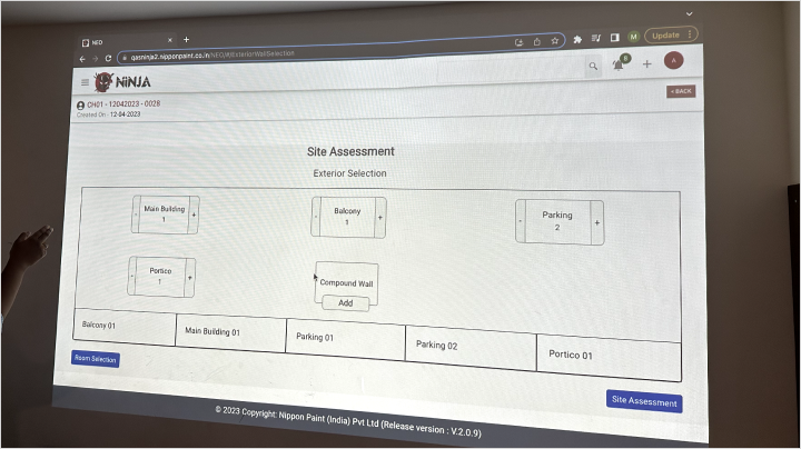
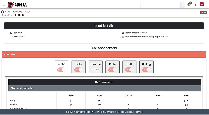
The old assessment flow asked Sales Officers to move through a long, linear sequence. Users had limited flexibility to pause, jump to a specific section, or review completed spaces.
The system also asked for repeated wall-level measurements, which increased effort during customer visits.
Too many long pages
Excessive scrolling
Unclear progress
Repeated inputs
Weak exit paths
Hard to review completed work
The issue was not just that the UI looked dated. The flow expected Sales Officers to behave like data-entry operators while they were actually doing field work.
We needed to reduce the attention the interface demanded without weakening the data needed for quotation.
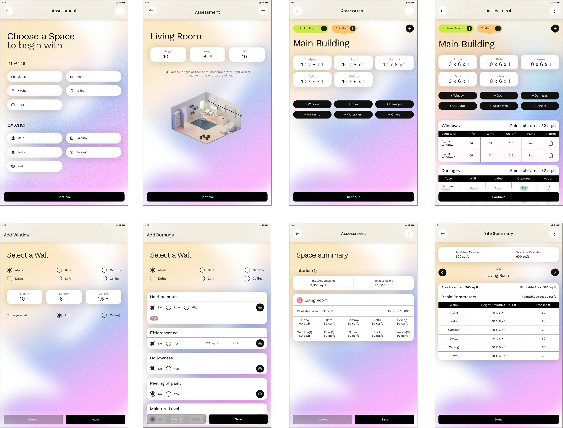
OLD MEASUREMENT MODEL
DESIGN DECISION
How might we help Sales Officers complete home assessments faster, with fewer repeated inputs, while keeping quotation data reliable?
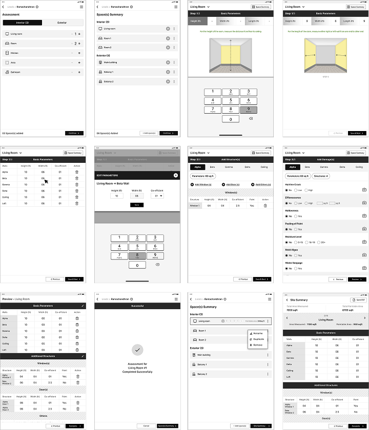
The biggest shift was the measurement model. Instead of asking Sales Officers to measure and enter every wall separately, we proposed a simpler room-level model based on three inputs:
Length x Width x Height
From these inputs, the system could estimate paintable wall and ceiling surfaces for standard room layouts. This reduced repeated data entry while keeping the output practical for quotation.
The redesigned assessment flow broke the task into clearer steps, made progress easier to follow, and gave Sales Officers better ways to save, continue, and review their work.
Start assessment → Add room → Enter measurements → Add openings → Review surfaces → Save/continue → Site summary → Quotation
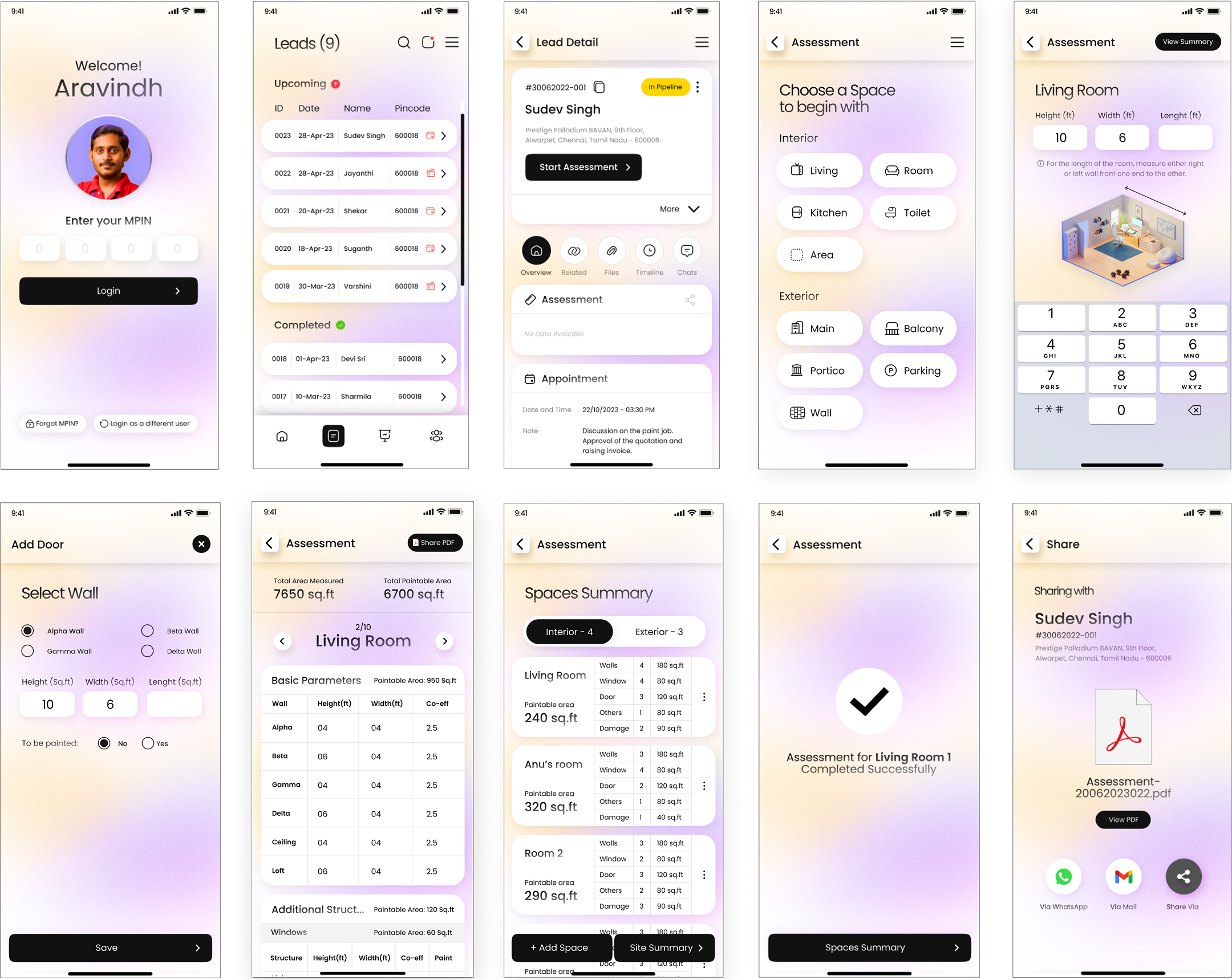
VISUAL DESIGN
The assessment flow had to work across tablet and mobile. Tablet screens supported more visible context, while mobile screens needed tighter prioritisation.
Across both, we focused on touch targets, readable hierarchy, persistent actions, and reducing the amount of scrolling needed during field use.
TABLET
MOBILE
IMPACT
The redesigned assessment experience reduced the time Sales Officers spent on key field-sales tasks. The biggest improvement came from the core home assessment flow, where task completion time dropped from 45-50 minutes to 25-30 minutes.
Site Summary add-ons and estimate preparation also became faster, showing that the redesign improved not just one screen, but the wider assessment-to-quotation journey.
REFLECTION
This project taught me that B2B UX is often about removing operational drag. A cleaner interface helps, but the real value comes from understanding what the user is trying to do under pressure.