HUMAN RESOURCES • 2021
Organisations are now talent first.
CONTEXT
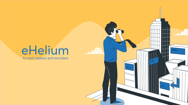
Solving hiring challenges for both seekers and recruiters.
eHelium was designed as a hiring platform that puts candidates closer to the center of the process while still giving organisations a clear way to track and monitor hiring across teams.
The work was about balancing two sides of the same product: a public experience for people exploring jobs and companies, and an internal view where recruiters could understand hiring activity without losing context.
CONTRIBUTION
My contributions were across...
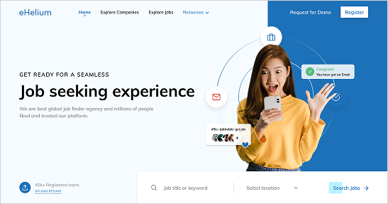
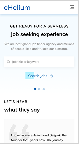
LANDING PAGE
A public entry point for talent-first hiring
The landing experience needed to explain the platform quickly, create trust, and guide different users into the right part of the product without making the first screen feel heavy.
EXPLORE JOBS
Helping candidates find the right opportunity faster
The explore jobs flow was designed around quick scanning: candidates could search, filter, and compare openings without losing the context they needed to make the next move.
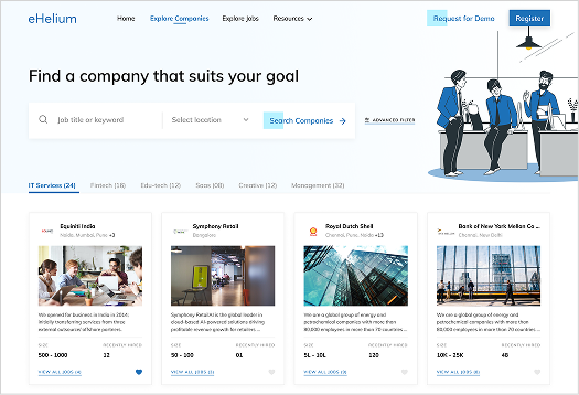
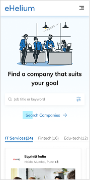
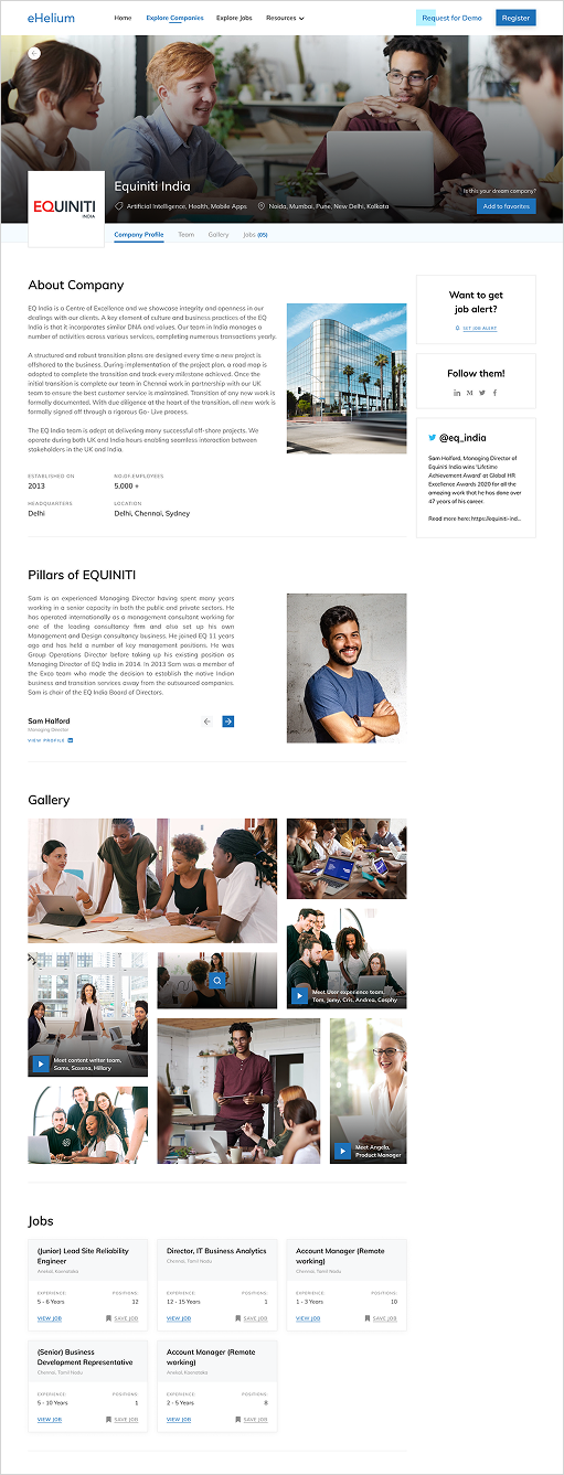
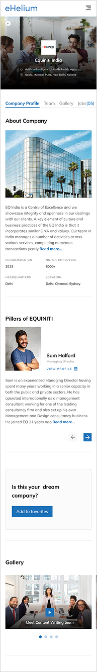
EXPLORE COMPANIES
Helping candidates understand companies before applying
The company profile page gave candidates more context before applying, from company details and teams to open roles, so the decision felt less like a blind application.
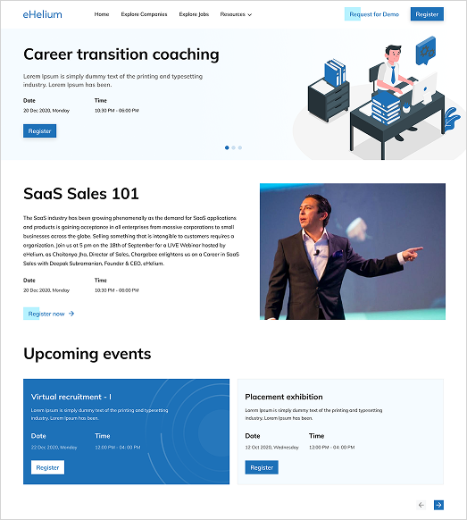
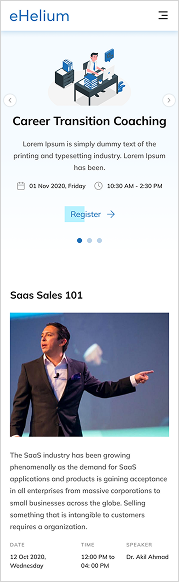
RESOURCES
Resources that support people before the next step
The resources area gave the product a softer learning layer, with events and career content sitting beside the core hiring flows instead of feeling like a separate destination.
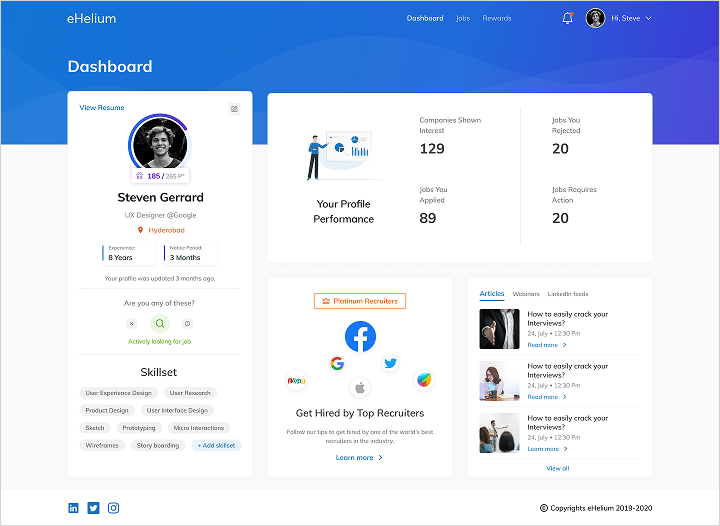
DASHBOARD
A clearer view of hiring activity
The recruiter dashboard brought hiring information into one overview, so teams could monitor activity, understand status, and move between operational tasks without starting from a blank view each time.
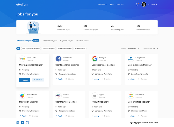
JOBS
Job management shaped around scanning and decisions
The jobs view focused on making roles easier to scan, compare, and manage. The goal was to keep the interface calm while still showing enough information for recruiters to make the next decision.
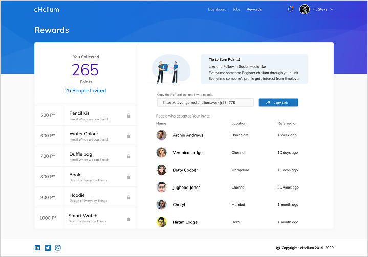
REWARDS
Reward moments that feel connected to the platform
The rewards area extended the product beyond job listings, giving candidates another reason to stay engaged while keeping the interaction language consistent with the rest of the system.
REFLECTION
This project was about keeping both sides of hiring visible.
eHelium reminded me that hiring products can easily become one-sided. If the product only serves recruiters, candidates feel processed. If it only serves candidates, organisations lose the operational clarity they need.
My focus was to create a structure where discovery, company context, job decisions, and recruiter workflows could live in the same product without making either side feel secondary.